
by Stefano Andriolo. Building on previous work, we refine a method to accurately determine the relationship between DFA alpha 1 and power. This method can be used to track fitness and thresholds of an athlete. We find in some cases ramp detection tends to overestimate thresholds, a finding mirrored in recent physiological papers. On the other hand, thresholds based on clustering of DFA alpha 1 values tend to agree well with this new method. We propose a hybrid lab and everyday workout experiment to further study the relationship.
The main content and results of this posts are:
Ever since the latest findings, we’ve been on a quest to pinpoint the most accurate way to map out the power -a1 relationship using everyday workout data. The pioneering method developed did a fantastic job in uncovering the link between cycling power and a1. However, it left us craving a technique that didn’t just unveil the correlation but could nail down the power-a1 relationship with precision. We're here to dive into why the original method didn’t fully satisfy this itch, propose a new method that builds upon it and share some points on its validation.
For those seeking a refresher on a1 or wishing to deeply understand the new method, we recommend revisiting our previous blog post.
In essence, we've crafted a novel method that offers greater consistency and reduces the likelihood of biases and errors when determining the power-a1 relationship, particularly in the dynamic range (a1<1), which is a critical area of study. This method builds on the previous one but introduces new ways of defining and fitting representatives to establish the power-a1 law.
We continue to analyze workout groups for their numerous benefits, as previously discussed. The data remains the same, focusing on the initial 30 minutes of a workout—when freshness is at its peak—and ensuring a sufficient duration within the dynamic range. For details on data collection, please see our last blog post. Our current discussion will solely focus on the new method.
But let us go in order. We will first highlight the shortcomings of the previous method, proceed with explaining how the new method addresses them and how it yields a better estimate of p(a1) law. Then we compare this result. Let's proceed step by step. We'll first pinpoint the drawbacks of the prior method, then explain how the new method overcomes these challenges and improves the estimation of the p(a1) law. We'll compare these findings to ramp- and clustering-derived threshold powers and conclude with a simplified version of the new method that allows for effective monitoring of power profile development at various intensities over time.
The "old" representative method efficiently uses the concept of condensing the information provided by a number of points in the a1-power plane into fewer 'representatives', which can be used to study the power to a1 correlation and ultimately find the relationship among these variables.
The reason we introduced this representative structure is that the power to a1 relationship suffers from a variety of temporal lags/cardiac delay and fatigue effects that destroy a straight-forward power to a1 correlation in everyday workout data:
Ideally, one would have extended periods where the athlete performs at stable power and a1, i.e. the effects of various lags are negligible and don't hinder determining the power-a1 relationship. Unfortunately, in real life workout data this is rarely the case.

Figure 1: An example of a workout's power vs a1. While the general inverse correlation is obvious there are visible lags such as the rather high a1 ~ 1.0 while already power > 200W at ~ 300 seconds or a1 < 1.0 while power already reduced to ~ 150W at ~ 700 seconds.
A method that would overcome these challenges would need to meet several criteria to be effective:
This is how we developed the ‘representative method’. While this was meant to be the first experiment in exploring the possible ways of representing (power, a1) data, it gave surprisingly good correlations and we decided to publish it. The idea is quite simple and relies on:
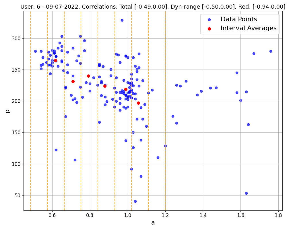
Figure 2: The representative method for an example workout. The blue points are all (a1, power) points of the workout. The red points are the representatives.
In particular, while the generic a1 values span the interval from 0.4 to 1.6 for most athletes, we are especially interested in the so-called dynamic range of a1 values, a1 < 1, because this is where the most useful thresholds are found. For each window, if it contains enough (a1, power) points, meaning the athlete spent a minimum amount of time in that window (at least one minute), we take as representative the point defined by the averages of a1 and power values, (avg_a1, avg_p). This is surely a simple enough procedure that meets requirements (1) and (3). As far as requirement (2) goes, the hope was that taking averages should make this issue weaker — more on this in the following.
The only open question in this method regarded how to choose the window size. We started with windows of 0.1 in the a1 range and stuck with it, though we think tailoring this to each athlete could potentially sharpen the method. The idea here is to consider the spread and density of an athlete's data points within the dynamic range to decide on the window size, but we didn't dive too deep into this aspect, thinking it wouldn't shake things up too much.
The method effectively uncovers correlations hidden within both unstructured and structured ERG mode workouts, showcasing its remarkable capability. However, its application to individual sessions revealed significant variability in outcomes, undermining reliability due to the diverse nature of workouts. Conversely, employing this method on aggregated data from multiple sessions within a week or ten-day span significantly enhances reliability and accuracy. This approach mitigates the variance seen in single workouts by leveraging a larger dataset, thereby improving the robustness of findings, reducing the influence of outliers, enabling better identification of non-responders, and more accurately modeling individual profiles. In fact, the novelty of this method lies not only in the use of representatives, but also in its strategic grouping of workouts to achieve a statistically sound representation of individual physical profiles.
The main issue with this method is that representatives thus defined are not always reliable. For a representative to truly reflect the data within its window, the data points need to be relatively close together, ideally clustering around a central spot. However, when data points are spread out or form more complicated patterns, it's hard to say whether these averages hold any real value. This is clearly visible in Figure 3. It is unclear whether we should use these points for the linear regression to find the power-a1 law.
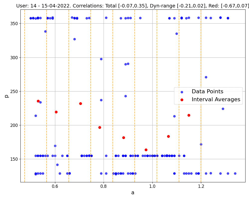
Figure 3: An ERG mode workout with a large spread in each window.
The initial solution we thought of was to give each representative a weight, leading us to adopt a weighted linear regression approach. Here, the weight of each representative is inversely related to the standard deviation of data points in its window. Essentially, this method prioritizes representatives from tightly clustered data, while those from windows with scattered points have less influence on the model.
The downside to this is pretty clear: if most of our representatives don't accurately capture their windows, then the overall regression model we get might not tell us much. Imagine a scenario where we have just 3 'good' representatives with a1> 0.7, while all representatives for a1<0.7 are 'bad'. In this case, the weighted regression would essentially ignore the less reliable points, creating a model heavily skewed by the few 'good' ones. Such a fit cannot be consistently trusted in the deep a1<0.7 region.
The reason the "old" representative method may fail resides in the way we understood and dealt with the cardiac lag.
To illustrate, consider an athlete with anaerobic threshold around 280W. Imagine them increasing their power output from 150W (easy domain, a1=1.2) to 250W (hard domain, a1=0.7) and then maintaining that level. At the onset of the increase, the a1 might remain elevated, say at 1.2, because of response lag—it doesn't immediately begin to decrease. The lapse from the onset of the power increase to the onset of the a1 decline represents the response lag. Subsequently, a1 decreases until it stabilizes at a consistent value, 0.7 in our case. This demonstrates stabilization time, defined as the interval from the first moment power hits 250W to the moment a1 stabilizes at 0.7, and it highlights that the a1 signal is more 'inertial' compared to the power signal, which responds instantly. It takes a notably longer period to settle into a new steady state after the power output has changed. This dynamic is applicable to both increases and decreases in power output, with a1 adjusting accordingly.
These effects are deeply entangled and tricky to identify during a typical workout. While response lag might be considered a unique physiological trait inherent to each individual, observing and analyzing stabilization times require a1 to actually stabilize, which depends on the intensity of power changes and time spent at given power. If there are no periods where a1 stabilizes, it implies that power is fluctuating (and thus inducing a1 fluctuations) within timeframes shorter than what's needed for a1 to adjust.
So, we can't just look at lag as the time between a power spike (local maximum) and when a1 hits its lowest point (local minimum), or the opposite. This interpretation doesn't give us the full picture because it misses out on how often someone changes their exercise intensity. Consider the previous example, where power jumps from 150W to 250W, but over different time frames. If they only keep up each effort for a minute, the a1 doesn't change much. The amount a1 drops in response to the power increase grows the longer the interval duration (2 minutes or more), until the duration is greater-equal to the stabilization time necessary for a1 to stabilize. For durations that are shorter, only local a1 minima are formed and they get deeper the longer someone stays at the new effort level. Thus the lag value increases accordingly (since the starting point, the moment power hits 250W, is always the same).
A real world example example for this might be a fast group ride in a small group with each athlete taking short turns at the front: the short time (seconds to maybe a minute) the athlete spends at high power output is not enough for stabilization at high intensity while the short break before the next turn at the front may be too short for a1 to increase even though the power output is significantly lower.
How is this 'combined lag' affecting data points in the a1-power plane, where any temporal reference is lost? And why didn't our old approach always effectively tackle this issue?
We can look at it using the same example. At 150W, which is relatively light for this athlete, a1 might hover around 1.2, creating a dense cluster of points near (1.2, 150W) on our graph. Let us consider long interval duration, longer than both stabilization times needed at 150W and 250W. The shift to 250W leads to a vertical leap on the graph: a1 stays the same initially. After a bit, as a1 begins to drop, we see a horizontal movement towards the higher intensity area (constant 250W), eventually settling at 0.7 as a1 stabilizes, forming another dense cluster around (0.7, 250W). If the power then drops back to 150W, the points initially shoot down vertically to lower power and then shift horizontally back to higher a1 values, gathering around (1.2, 150W) once more. Shorter intervals between power changes create a pattern that's more vertical. Obviously, this is a simplified view—the real trajectory is smoother and varies with the power levels and time spent.
This example sheds light on the limitations of our previous method, which assumed that within each window (or segment of similar a1), power changes caused by lag would be roughly equal and opposite, so averaging them out would negate any spikes or drops. However, for certain workout structures the described scenario and actual workout data show that lag influences different a1 regions uniquely, illustrating why our old approach can fall short.
Specifically, when there's a sudden drop in power at low a1 levels following an intense effort, the average power in that period gets noticeably lower. As highlighted from Figure 3, this effect becomes more stark with fewer data points in a window or when a window contains a similar number of points at widely varying power levels within the same a1 range. This scenario is typical in workouts with very short-term structure. Both situations distort the average power values for different reasons. While mixing a variety of workout types may lessen this distortion, the issue doesn't completely disappear.
Given the scarcity of stable points as mentioned, solely relying on them for representative values isn't viable. The next best approach is to identify representatives through data clusters. Although the majority of clusters do not correspond to stable a1 windows (since the temporal reference is lost, particularly when grouping together workouts), they surely contain them. Furthermore, defining representatives using clusters from a mix of workouts is theoretically appealing. It's based on the straightforward idea that:
If a pattern in the data consistently shows up short-term across various days and session types, it likely follows an underlying rule.
Machine learning algorithms, especially those focusing on point density, often fall short in identifying data clusters within datasets rich in noise. This challenge led to the development of a nuanced, classical algorithm known for its clarity and adaptability—a grid-based approach, outlined as follows:
The grid method aims to highlight areas of higher point density effectively. Cell size is critical—too large, and we risk overlooking details; too small, and cells may lack data. Through experimentation, certain cell dimensions and thresholds have been identified that efficiently pinpoint cluster representatives across varied datasets.
As part of our validation process, we also examine what we refer to as 'best averages'. These are specific points (best_avg_a1, best_avg_p) obtained as top moving power averages across various time spans, ranging from 3 to 20 minutes—the same used for calculating Critical Power. While these points aren't ideal representatives for the entire dataset since they only shine during maximal effort, and thus reflect the high-intensity zone, they may serve the role of testing the accuracy of the relationship uncovered by our method. Visual inspection confirms that best averages tend to align closer to the new method's rather than the old method's regression. In particular, this is the case in 58% of the workout groups evaluated where both methods yield a result (the old method almost always finds representatives, while the new method, being stricter, does not always find clusters). The new method performs clearly worse than the old one in 22% of cases. Finally, in 20% of situations, they are either equally good (usually the case when raw data points already exhibit a clear linear relationship) or equally bad (when there is no clear correlation between a1 and power aka athlete is a non-responder). An example is provided in Figure 4.

Figure 4: Comparing the new grid method (black triangles) with the old representative method (red dots). The grid based regression (black dashed line) aligns much better with the best efforts (green squares) than the representative based regression (red dashed line).
Now that we have found a better way to uncover the power-a1 relationship in the entire dynamic range, we can use the linear law from each workout group to extrapolate power values at given a1 values, as a1=0.5, 0.75, 1, or similar. For consistency reasons, we do so in the a1 region covered by the fit.
We can use these three (or more) power values to track fitness over time. In particular, this allows to track how fitness at different intensity changes over time, permitting to track the athlete adaptations to different training regimes and intensities. This is extremely valuable not only in qualitatively understanding whether one athlete is more of a volume/intensity responder, but also in quantifying how much the powers at low, moderate and high intensity are changing with training as implemented in models of AI Endurance.
We can now check whether the grid method inferred power values at a1=0.5 and 0.75 are different or not with respect to power values obtained with a a1 ramp test or a1 cluster threshold detection in AI Endurance.

Figure 5: Comparing the grid method (black triangles) and the representative method (red dots) with ramp and clustering detection in AI Endurance. Grid method better accounts for the a1 data between 0.75 and 1.0 than the representative method. Ramps (blue diamonds) overestimate thresholds relative to both the grid and the representative method in this example whereas average of cluster thresholds (orange diamonds) fit both models rather well.

Figure 6:Comparing the grid method (black triangles) and the representative method (red dots) with ramp and clustering detection in AI Endurance. Grid and representative method lead to almost identical results in this example. Again, ramps (blue diamonds) overestimate thresholds relative to both the grid and the representative method in this whereas cluster thresholds (orange diamonds) fit both models rather well.

Figure 7: Example of a detection of a 0.75 ramp like-effort in AI Endurance: starting at around 8 minutes there is a steady increase in power and steady decrease in a1 values. The a1 values used to estimate the 0.75 ramp threshold are the solid blue dots. Muted blue (yellow) dots show clustering threshold detection at 0.75 (0.5).
Since AI Endurance automatically detects ramp-like efforts around a1=0.5 and 0.75, we can check if these ramp-derived (first and second) threshold powers correspond to the grid method inferred powers. We found the following results out of 50 workout groups with detected ramp efforts:
Here, "higher" means the ramp value is at least 110% the grid inferred value; "lower" at most 90% the grid inferred value and "same" the ramp and grid inferred value are within a 10% deviation.
It's important to remember that ramp-like efforts are not necessarily following the ramp test protocol but could happen during any workout if the criteria of a ramp are met, for example steadily increasing power with a ramp rate of 10-30W/min, steadily reducing a1, and sufficient coverage in the a1 interval to determine the ramps at 0.75 and 0.5. These are essentially efforts that mirror the standard prescribed a1 ramp test.
Examples of higher ramp inferred values at both a1=0.75 and 0.5 can be seen in Figure 5 and 6.
Interestingly, there have been a few findings in recent literature of ramp detection (particularly at 0.75) overestimating VT1 [8, 9, 10], however see also e.g. [11] as a recent study finding no overestimation. A potential reason for this overestimation may be that for a certain number of athletes, cardiac lag and stabilization times are too long for the given ramp rate: while the athlete is still lagging behind in a1 signal at a given power, i.e. a1 hasn't stabilized yet, the ramp protocol already moves on to the next ramp step. This would clearly result in overestimation of thresholds. We definitely see a range in stabilization times and for some athletes in our data set it does appear too long for a ramp rate protocol of 10-30 /min which is somewhat standard.
However, there have been studies [12] to assess threshold assessment as a function of ramp rate that did not find a dependence on ramp rate which seems to contradict this point. One also has to keep in mind that for too slow a ramp rate, fatigue kicks in - especially around VT2 - that would result in reduced a1 due to exhaustion and hence an underestimation of thresholds. There is a limited window of ramp rates that are a) not too fast for lag to mess with the results and b) not too slow for fatigue to kick in. The fact that both lag and fatigue onset seem to depend on the individual athlete may make it difficult to prescribe a universal ramp protocol that works for all athletes.

Figure 8: Example of a 0.75 clustering threshold detection: the muted blue dots and their corresponding power values are used to estimate the 0.75 cluster threshold in this example.
AI Endurance also estimates a1 thresholds via clustering: it collects power values when a1 stabilizes around 0.75 and 0.5, and computes the power average. By definition this method thus computes power values related to somewhat stable a1=0.75 and 0.5 values. If the points in the stable window are enough, such that the points affected by the lag are the minority, the power average is in principle a good estimate, and it should closely match p(0.75) and p(0.5) obtained with the new method. Since we are working with workout groups, we can check that this is indeed the case by taking all these power estimates and averaging them across all workouts in the group: the clustering averages are in much better agreement with the p(0.5) and p(0.75) values inferred by the new grid method, see Figures 5 and 6.
Thus, we can conclude that, a good way to track fitness that is backed by the new algorithm we developed is:
Clustering thresholds are already implemented in AI Endurance so athletes are already benefiting from this detection method that is per definition more reflective of stabilized intensities than ramp efforts. It is very encouraging that clustering thresholds actually match the grid method inferred thresholds at 0.75 and 0.5 quite well. While AI Endurance's models currently give more weight to ramp detected HRV thresholds than clustering detected thresholds, we may re-evaluate this in light of this finding and push more weight onto clustering detection.
A missing link here is to tie the grid inferred/clustering thresholds to VT1 and VT2 as measured via gas exchange. To this end we propose the following hybrid lab and everyday workout experiment:
Tying to gas exchange thresholds would put the clustering method on solid footing and would potentially help to overcome the above listed lag induced challenges that complicate the power-a1 relationship and impair the detection of ramp thresholds.
Finally the clustering method promises a lot more convenience and ease of use for the athlete as they don't have to follow a specific test protocol such as a ramp and can just go about their planned workout routine without testing interruptions.

Use Zwift running workouts to increase your running pace with a data-driven, personalized and predictive Zwift running training plan from AI Endurance.

There are different options on the market for optimized AI training plans that are based on applying machine learning to your individual data. In this post, we compare the different options and their features.

Apple Watch has been a popular choice in running and triathlon. You can now track and execute your AI Endurance custom running, cycling and swimming workouts on your Apple Watch.

When it comes to excelling in endurance sports such as triathlon, running or cycling proper nutrition plays a crucial role in maximizing your performance and achieving your goals. Whether you're swimming, cycling, or running, your body requires optimal fuel to meet the energy demands of these activities. In this blog post, we'll explore the importance of nutrition in triathlon, running, and cycling, followed by an introduction to the new feature of AI Endurance which provides recommendations for daily and activity specific nutrition requirements individualized for each athlete.