Published Nov 9, 2023 · Updated Sep 4, 2024
by Stefano Andriolo. We demonstrate a universal relationship between cycling power and DFA alpha 1 from every day workout data that allows accessible and regular tracking of aerobic and anaerobic thresholds without the need of an exercise lab or even a dedicated testing protocol.
DFA alpha 1 (a1) is a metric derived from Heart Rate Variability (HRV) data, and is used to estimate aerobic and anaerobic thresholds in individuals. It also provides a means to assess an individual's physiological states, particularly during exercise: the lower a1, the more acute exercise stress your body is dealing with. For example, if a1 crosses below 0.75, you cross your aerobic threshold. Once a1 drops further below 0.5, you cross your anaerobic threshold.
Knowledge of an athlete's aerobic and anaerobic threshold is important to prescribe appropriate exercise intensities in a training plan. It allows to correctly set productive training intensity zones. Regular automatic assessments of these thresholds improves the amount of data of the implication that different training regimes can have on an athlete's fitness, as learned by the machine learning models of AI Endurance (digital twin of each athlete).
a1 is a measure of internal effort. Hence, it is expected to have an high degree of correlation with external metrics defining the effort such as power (in cycling and running) or pace (in running and swimming): the higher the power/pace, the lower a1, where the precise relationship between a1 and power/pace is expected to depend on the individual.
So far, the exploration of the relationship between power or pace and a1 in the scientific literature has necessitated meticulous protocols such as ramp tests, to be conducted within the controlled confines of a laboratory. These protocols, although accurate, pose a significant barrier to the real-world applicability and understanding of this valuable metric out 'in the wild'. The analysis described here does not rely on laboratory data but instead data collected through the AI Endurance app. Furthermore, data collection was entirely passive as the participants did not follow a particular set of study instructions during their workouts.
Here, we present a novel approach that leverages everyday workout data, unshackling the analysis from the stringent requirements of lab-based experiments. Focusing on cycling power, and utilizing a diverse range of workout data, collected across varying intensities and conditions, we have devised an effective method to elucidate the correlation between power (p) and a1.
Briefly, our new method is to define representatives of each a1 - power/pace data cluster via a simple averaging procedure that alleviates the effects of cardiac lag that otherwise create noise in the a1 - power/pace relationship and to consider workout groups instead of individual workouts.
We expect our findings will help improve
We define a non-responder as an athlete with poor correlation between a1 and power/pace and/or power/pace values at a1 = 0.5 and a1 = 0.75 that are nowhere near their actual ventilatory anaerobic and aerobic thresholds. While we could not identify a non-responder in this study, some athletes report markedly suppressed a1 < 0.5 already at the commencement of exercising.
Our analysis:
These results are generally present in all of the randomly picked data of athlete's that have agreed to share their exercise data in AI Endurance for research purposes.
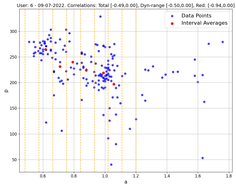
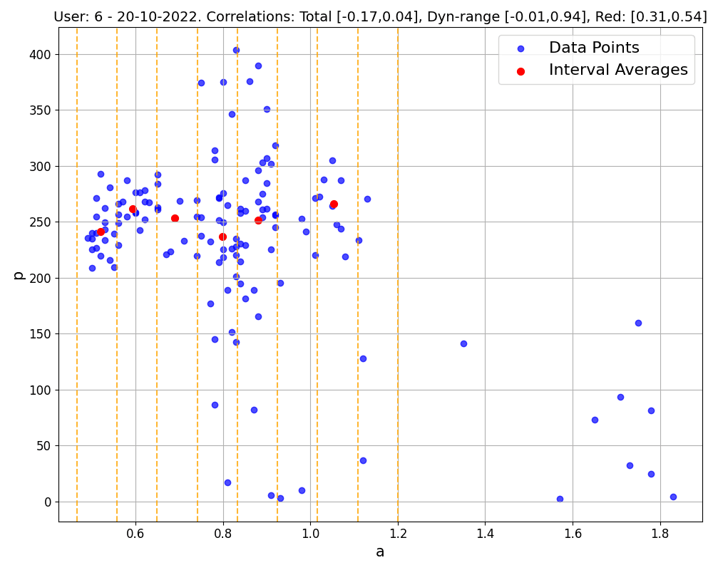
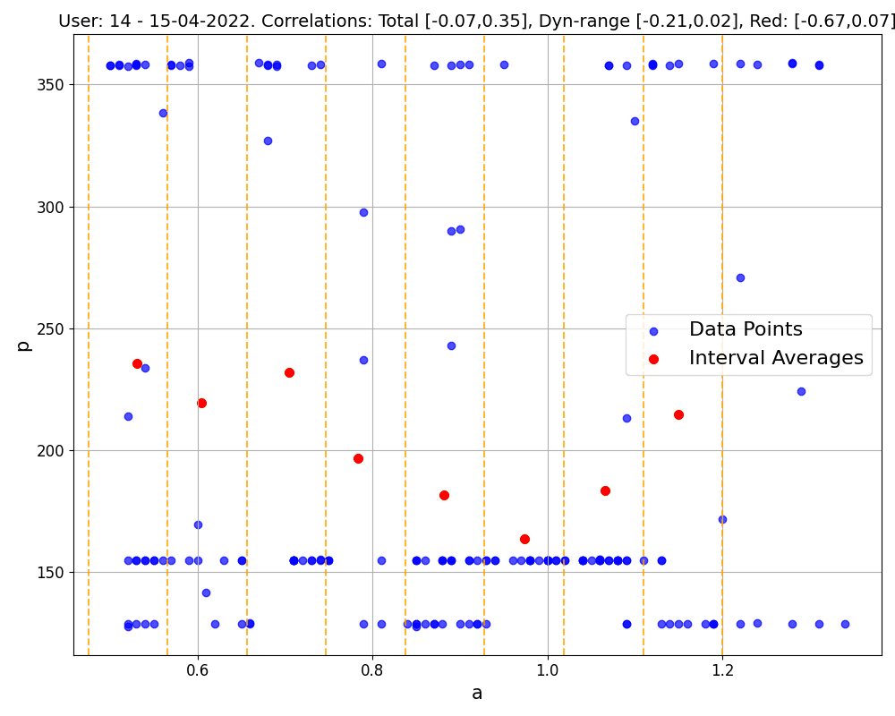
Figure 1: Correlations (and relative p-values) within single workouts. The first 2 workouts belong to the same user, the third corresponds to a workout executed in ERG mode. Blue points are the (a1, p) data collected, and are used to compute the 'total' correlation and the 'dynamical' correlation (considering blue points with a1<1). Red points are the representatives of each a1 interval (marked by yellow dashed lines, up to a1=1.2), and are used to compute the 'red' correlation following our method, as described below.
Our analysis reveals a notable trend: in 74% of cases, the correlation obtained using the representative method is lower than that obtained using the standard approach. The standard approach refers to using the (a1, p) data in its entirety without representatives. 44% of workouts showing a correlation below -0.7, compared to just 3% when all data points are considered (see Figure 3 for detailed statistics). This finding underscores the effectiveness of our representative-based method in most scenarios.
Delving into specific examples, as depicted in Figure 1, we observe that in common workout scenarios, the correlation derived using our method is generally stronger than that calculated using all data points. This is particularly evident in the first and third workouts shown. Notably, the third workout exemplifies the method's efficacy even in complex exercises like those performed in ERG mode.
It's important to note, however, that our approach does sometimes reveal only a weak correlation, possibly due to factors like limited data or a focus on certain representative regions (e.g., where a1>1), as illustrated in the last workout of Figure 1. Such weak correlations can also occur in data-richer workouts, as seen in the middle workout of Figure 1. If weak correlations are consistently observed across an athlete's workouts, it might indicate a non-responder pattern. These observations suggest that broader datasets could provide more comprehensive insights. This expectation is indeed confirmed when considering bigger datasets obtained by merging multiple workouts together.
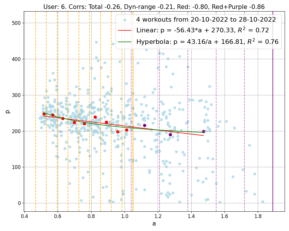
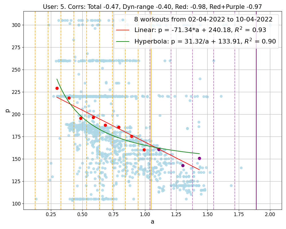
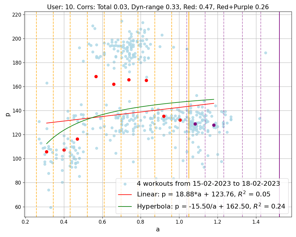
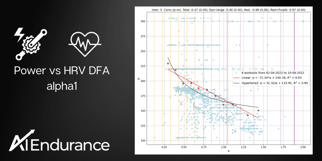
Figure 2: Correlation of data points obtained by merging workouts into groups. The groups shown correspond to different users and contain 4, 8, 4 workouts respectively. Light blue points represent all workout data collectively, while red and purple points are the representatives computed inside and outside the dynamical region respectively. Notice that the first group contains the second workout shown in Figure 1, and the second group refers to an athlete often using ERG mode. The final image in the figure presents our least successful result, the only group showing a positive correlation, which belongs to a user who has a total of 13 workout groups. Additionally, each group is analyzed with linear and hyperbolic fits, and their corresponding equations are displayed. The goodness of these fits is measured by the R^2 value, with a value closer to 1 indicating a more accurate fit.
Larger datasets are obtained by grouping workouts executed within a short time frame, as 10 days. Each workout group is nothing but a 10-day snapshot of data regarding external (power) versus internal (a1) effort, and offers a more nuanced understanding of performance. However, it's important to limit the time frame, like 10 days, to avoid the influence of physiological adaptations on our short-term analysis.
As Figure 3 illustrates, our method consistently outperforms the standard correlation calculation approach for all users. Now, the majority of the correlation values fall below -0.7, and the number of positive correlation is reduced extremely. Indeed, only one group out of 73 shows a positive correlation, which is the same group depicted in the third image of Figure 2.
In fact, there is a number of benefits in considering workout groups:
In Figure 2, we explicitly show the values of the parameters m and q. These two parameters are not only user dependent, but also vary with fitness. For example, if an athlete achieves higher power for given a1 over time, i.e. growing fitness, the parameters m and q will change.
This law can be used to track the fitness level of each user across time and it offers a method to estimate the most current values of power at both aerobic and anaerobic thresholds, pAE = m × 0.75 + q and pAN = m × 0.5 + q without the need for any specific testing protocols, but simply out of the most recent workout history!
This is a major implication of our analysis: we can track an athlete's threshold without an exercise lab, without a testing protocol, only requiring them to enter the dynamic a1<1 range somewhat regularly during their workouts with clean HRV data.
In analyzing the correlation between power (p) and the intensity marker (a1), certain prerequisites must be met for the data:
Data Quality: Precision is crucial, especially since power meters are generally more reliable (with about 1% error) than heart rate (HR) monitors and HRV detection. This is particularly true when considering artifacts - e.g. missed beats by HR monitors - which can significantly affect the a1 calculation. Hence, our focus is on workouts with a maximum of 5% artifacts. From an initial pool of 3123 workouts across 21 users, this criterion narrows down our dataset to 2096 workouts (still 21 users), forming 411 10-day workout groups.
Fatigue Consideration: To mitigate the impact of fatigue, we concentrate on the first 15 minutes of each workout.
Data Consistency: Inconsistent data, especially during periods without pedaling (where power, p, equals 0), can skew results. Indeed, while stopping spinning for few seconds once in a while is not a problem, it becomes one when it is done for longer times and/or very frequently. In such a situation, we would have a lot of data points with the same power value p=0 and different values of a1, that is different levels of internal stress, significantly spoiling the correlation. To maintain consistency, we exclude workouts with prolonged or frequent periods of no pedaling and discard data points with p=0.
Data Range and Intensity: For a meaningful correlation between p and a1, a sufficient range of the intensity marker, a1, is necessary. We focus on datasets where at least 50% of the data points are within the dynamic range (a1<1), which indicates a significant effort level. We do not process data with mostly a1>1, typically corresponding (in healthy individuals) to very easy rides.
The last criterion is the most restrictive, reducing the number of eligible single workout datasets to 554 across 17 users, and workout groups to 73 across 11 users. This reduction is also influenced by our decision to exclude workout groups with fewer than 4 workouts to minimize the influence of individual workouts on the overall group analysis.
Even after meticulous data selection, directly correlating p and a1 using all data points available (p, a1) typically yields weak correlations, as illustrated by the blue histograms in Figure 3. This is due to the fact that, while data points are a list of (p, a1) pairs collected at the same time, there is a physiological lag in the heart response (and thus HRV and a1) to an increase/decrease in power output.
This physiological lag means that when a user suddenly increases power, there are data points with high power but still high a1, as the latter takes time to catch up. Similarly, during a decrease in power (especially after intense effort), there are points with low power but still low a1. These inconsistencies lead to poor correlations.
An example would be an athlete attempting a short, say ~2 min, power burst after riding at low intensity and going back to riding at low intensity after the effort. The athlete goes through the following stages:
The raw (a1, p) data of this example exhibits data points outside the expected negative correlation, e.g. high a1 and high p as well as low a1 and low p data. To address this issue, we have developed a method to smooth out these problematic data points:
By applying this technique, the correlation values obtained are significantly stronger than the standard method. For most users, these improved correlations indicate a strong relationship between power and a1, aligning with our expectations.
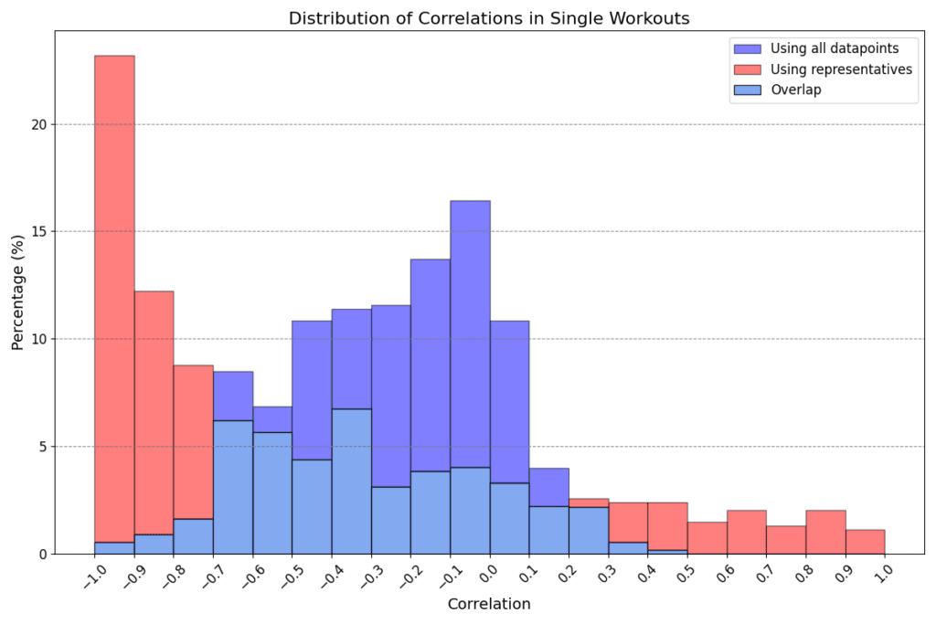
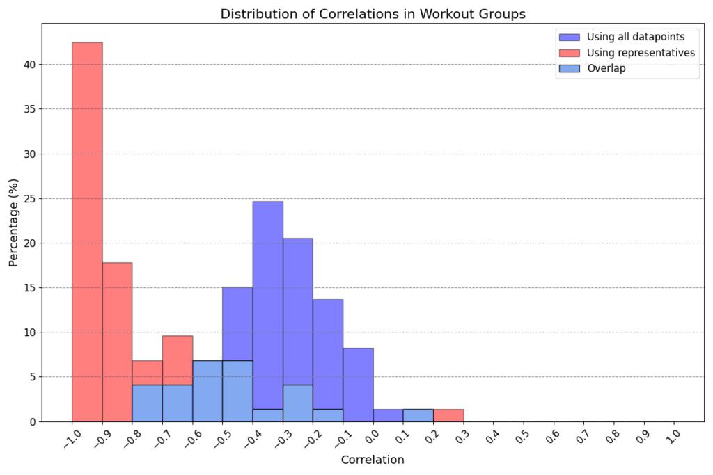
Figure 3: Distribution of correlations obtained in all workouts (above) and workout groups (below). Blue shows the correlations obtained using all data points, red shows the smallest correlation obtained with our method, that is either the red or the red+purple one in Figure 2.
The use of representative points to calculate correlations significantly alters the results when compared to the standard method. This effect is clearly visible in the histograms in Figure 3, which illustrate an exaggeration of standard correlation values, typically leaning towards -1.
Regarding single workouts (first histogram), the mean for the standard correlation (blue) is -0.25 with a standard deviation of 0.26, and the range spans from -0.95 to 0.41. In contrast, correlations of representatives (red) show a mean of -0.44 with a broader standard deviation of 0.55, and the range extends from -1 to 1. Notably, while only 3% of workouts have a standard correlation below -0.7, this proportion dramatically increases to 44% when using representatives. Furthermore, in 74% of cases, the correlation calculated with representatives is lower (stronger in a negative sense) than the standard correlation.
The same pattern is observed for workout groups. The mean values for standard (blue) and representative (red) correlations are -0.32 and -0.75, respectively, with standard deviations of 0.19 and 0.27. In this scenario, a significant 66% of workout groups exhibit a red correlation below -0.7, compared to only 4% in the standard case. Moreover, in 96% of workout groups, the red correlation is smaller (stronger) than the blue one. This implies that all users have at least 92% of their workout groups showing an improvement in correlation calculation with our method over the standard approach.
When considering the two-parameter fits to determine the relationship between power output and physiological response, our analysis does not distinctly prefer either the linear p = m × a1 + q or the hyperbolic p = c / a1 + d model. Both approaches seem equally valid in the context of both the dynamic and the entire a1 range, as illustrated in Figure 4. Given the lack of a clear advantage for one model over the other and the current size of our dataset, we lean towards adopting the linear model for its simplicity and ease of interpretation.
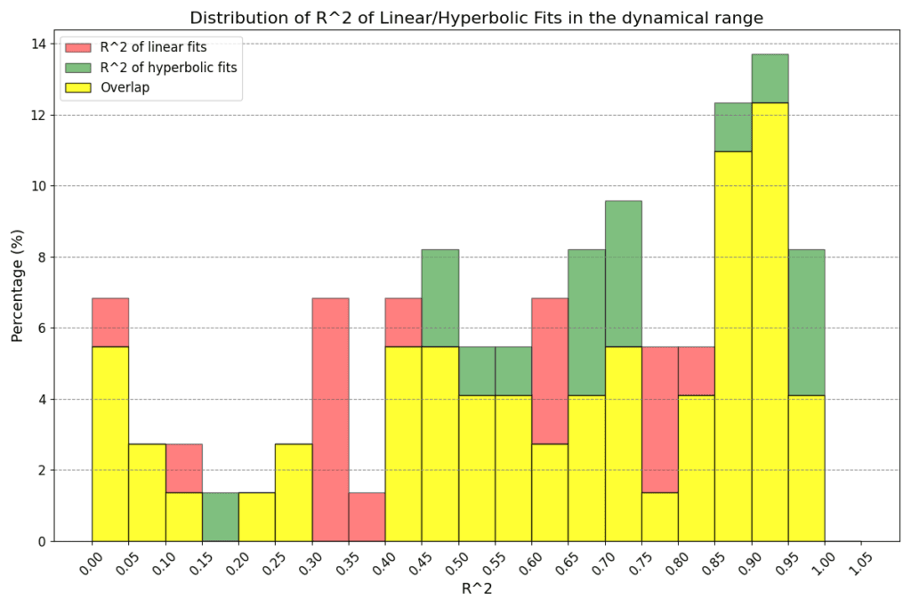
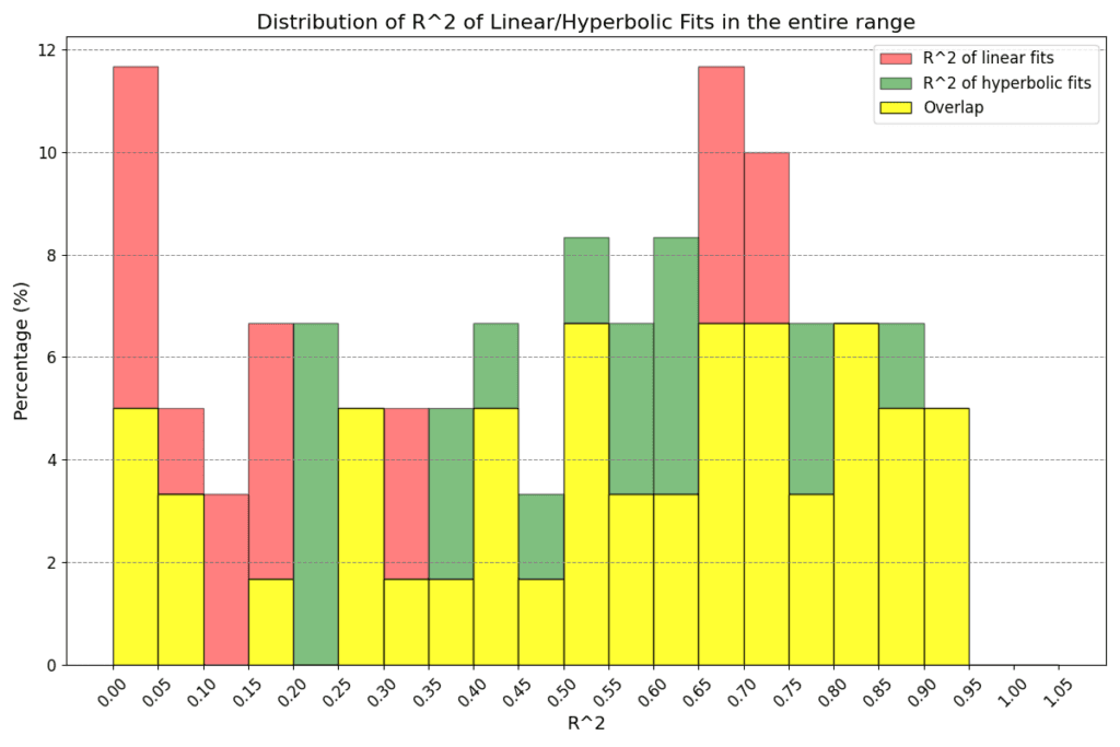
Figure 4: Goodness of linear and hyperbolic fits in the dynamical region (above) and entire region for a1 (below). The greater the R^2, the better the fit. In the former case we have means 0.59 and 0.64 (standard deviations 0.29 and 0.28) for linear and hyperbolic law respectively, while in the latter case we have means 0.49 and 0.54 (standard deviations 0.30 and 0.26) respectively. There is no clear indication on whether one type of fits should be preferred to the other.
A bigger dataset may reveal the most suitable model to represent the universal relationship between power and a1 in the future.
Use Zwift custom workouts to grow your FTP with a data-driven, personalized Zwift custom training plan from AI Endurance.

If you do not want to use Zwift or other virtual platforms, you can simply execute your AI Endurance cycling workouts by letting your Garmin control your smart trainer. For example, let your Garmin Edge 530 or Forerunner 945 control your Wahoo Kickr trainer. All smart trainers supporting the ANT+ FE-C protocol, including Tacx, are supported.

Before every workout you should know if you're actually ready for it. Everyone responds differently to stress, bad sleep and exercise fatigue - our new recovery model makes data driven decisions about when you should train and when you shouldn't - based on heart rate variability (HRV).

by Markus Rummel. Coaching endurance athletes well takes time. Reviewing data, adjusting plans, responding to how each athlete is recovering and progressing: there is a limit to how many athletes you can closely monitor before the quality of attention starts to drop.